
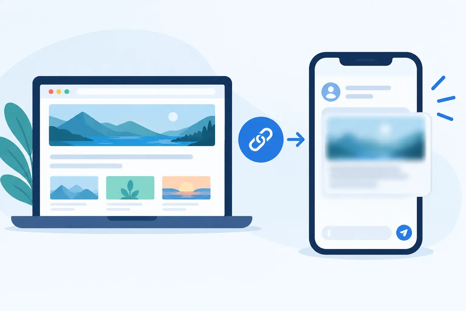
A sharp hero image on your site can turn into a fuzzy, low-rent card the second someone shares the URL in Slack, LinkedIn, or iMessage. That gap is why previews blur: the image displayed in a social card is often not the same asset, size, or version your visitor sees on the page.
A blurry preview is not a small cosmetic issue. Shared links are often the first visual contact someone has with your brand. If the card looks compressed, stretched, or soft, the post gets less attention and the brand behind it feels less considered. The good news is that blur usually has a specific, fixable cause.
Why previews blur on social platforms
A link preview is built by a platform's crawler, not by the browser of the person sharing it. The crawler reads your page's Open Graph metadata, finds the image in the `og:image` tag, downloads that image, and creates a card according to that platform's own rules.
That process creates several opportunities for quality to drop. Your page may point to an image that is too small. Your CMS may serve a compressed thumbnail instead of the original. Or the platform may resize and recompress an image to fit its preview layout.
The main rule is simple: social platforms cannot create detail that is not in the source file. When a 600-pixel-wide image is stretched into a large preview, text softens, logos lose their edges, and photos become visibly pixelated.
The OG image is too small
For most social cards, 1200 by 630 pixels is the safest starting point. It gives platforms enough pixels to display a wide, high-quality image without forcing them to enlarge a smaller asset. A 600 by 315 image has the same shape, but only one-quarter of the total pixels. It may look acceptable in a compact mobile card and noticeably blurry in a larger desktop preview.
This matters most when your design contains small type, thin lines, screenshots, or detailed product UI. A photo can tolerate some compression. A small headline rendered into an undersized image usually cannot.
Using an oversized image is not always better, though. Huge source files add download time for crawlers and may still be recompressed by the destination platform. Start with a well-optimized 1200 by 630 pixel JPG or PNG, then test the actual shared result.
The image is being cropped or stretched
A preview can look blurry even when the original file is large enough. The problem may be an aspect-ratio mismatch. Your CMS may generate a square featured image, while a social platform expects a wide card. The platform then crops, letterboxes, or resizes that image to fit.
Stretching is particularly damaging. It distorts logos and makes text look soft because pixels are being interpolated in one direction. Cropping creates a different problem: your subject or headline may survive, but the platform has to scale the remaining area more aggressively.
Use one dedicated landscape OG image where possible. Keep key text, faces, and logos away from the edges. The exact crop differs by platform, so a little safe space prevents a good design from becoming an awkward card.
Your site is serving a compressed derivative
Many websites optimize images automatically. That is usually good for page speed, but it can quietly damage social previews. A WordPress theme, image CDN, or optimization plugin may substitute a smaller image URL in your metadata. Some setups also apply aggressive JPEG compression or convert an asset into a format a crawler does not handle consistently.
Check the actual image URL declared in `og:image`, not just the image you uploaded to your media library. Download that exact file and inspect its dimensions and visual quality. If it is a 300 by 300 thumbnail, the issue is already present before LinkedIn or WhatsApp ever touches it.
Be careful with image transformations triggered by URL parameters as well. A URL that requests `width=400` might be perfect for an on-page card and completely wrong for a social share.
Metadata mistakes that make previews look worse
Image quality is only one part of the preview. Incorrect metadata can cause platforms to choose an unexpected fallback image, pull a low-resolution favicon-like asset, or retain an old version of the card.
Your page should provide a direct, publicly accessible `og:image` URL. It should return an image file, not an HTML page, login screen, redirect chain, or an asset blocked by firewall rules. Crawlers do not behave exactly like normal visitors, so an image that loads for you is not proof that a social platform can fetch it.
Adding `og:image:width` and `og:image:height` can also help platforms understand the intended image dimensions before processing the asset. These fields do not magically improve quality, but they reduce guesswork and make your metadata more explicit.
Dynamic pages can publish the wrong image at the wrong time
SaaS sites, documentation hubs, stores, and blogs often create page data dynamically. A new page might publish before its featured image, title, or image-rendering process is ready. When a crawler arrives during that gap, it may fetch a placeholder or fallback asset and cache it.
The result can be a blurry generic card even after the final image exists. This is common with client-side rendering, delayed image generation, and pages that rely on JavaScript to insert metadata after load. Social crawlers need the right OG tags in the initial server response.
For template-driven sites, make sure each URL resolves to its own completed image and metadata at publish time. One shared default image is better than a broken preview, but it gives every article, feature page, and product page the same visual signal. It also makes reporting and testing harder because you cannot immediately see which page was shared.
Caching can make a fixed preview stay blurry
You replace the image, refresh the page, and the preview still looks bad. That is usually caching, not a failed fix.
Platforms store preview data so they do not have to crawl every URL every time it is posted. Some hold onto an image for hours or days. Others re-fetch when the image URL changes, while some will continue showing the old card until their cache expires or is manually refreshed through their own debugging tools.
Changing the image file at the same URL is less reliable than publishing a new versioned image URL. For example, an image URL with a version value or a newly generated filename gives the crawler a clear reason to request a fresh asset. Do not change URLs casually for every share, but use versioning when a major preview correction needs to propagate.
Caching can also happen at your CDN. If your CDN returns an old, compressed image while your site editor shows the new one, the crawler only sees the old file. Purge or revalidate the asset before treating a platform cache as the culprit.
How to diagnose a blurry preview quickly
Start with the page, not the social post. View the source or use a preview checker to confirm the exact `og:image` URL, title, and description a crawler receives. Then open the declared image directly and check three things: its pixel dimensions, its file size, and whether the text and logo are already sharp at full size.
Next, test the URL in the platforms that matter to your audience. X, LinkedIn, Slack, Facebook, WhatsApp, and iMessage do not all render the same way. A card that looks fine in one place may be cropped or compressed differently in another.
If the source image is crisp but only one platform is blurry, you are likely dealing with that platform's processing or cache. If the source itself is soft, fix your image generation or CMS output first. If the wrong image appears, inspect your metadata priority and any plugin, theme, or framework that may be overriding it.
Build previews as part of publishing, not cleanup
Manual design workflows break down once a site has more than a handful of pages. Someone has to create an image, export the right dimensions, upload it, attach it to the correct URL, and repeat the process for every new post or product. That is how low-resolution fallbacks and mismatched templates slip through.
A better setup treats the social card as a generated publishing asset. Design the visual system once, map it to live page data, and render a correctly sized image for each URL. That gives a new article its own title, photo, author, date, or product detail without asking someone to open a design tool again.
getwowlink is built for this workflow: one brand-controlled design can populate page-specific OG images automatically, while your existing SEO setup remains in place. The key benefit is not just saving design time. It is removing the gap between publishing a page and giving that page a sharp, recognizable share card.
A preview should look intentional at the exact moment a link leaves your site. Check the asset your crawler sees, give it enough pixels to survive platform processing, and let each new page carry a card that looks like it belongs to your brand.
