
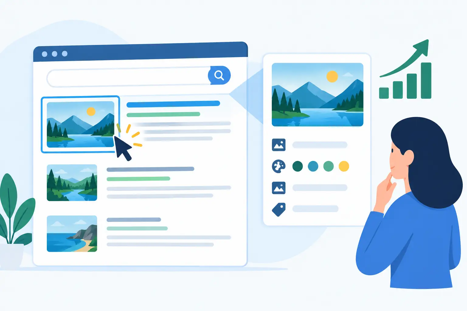
A link lands in Slack, LinkedIn, or iMessage. One version appears as a plain URL with a generic thumbnail. Another appears as a clean, on-brand card with a relevant image, sharp headline, and clear source. The destination may be identical, but the choice is not. Can metadata images improve clicks? In the places where people encounter shared links, they can make a meaningful difference.
The key is understanding what they improve and what they cannot fix. A polished Open Graph image does not make weak content valuable. It does make a good page easier to notice, recognize, and trust before someone commits to clicking.
Metadata images improve clicks by winning attention
Metadata images are the visual assets attached to social-sharing tags, usually Open Graph tags such as `og:image`, `og:title`, and `og:description`. Platforms read that metadata and turn a URL into a link preview. Depending on the app, that preview may show a large image card, a compact thumbnail, or a text-first summary.
That preview is your page's first impression in a crowded feed or conversation. People scan fast. A relevant visual gives them a reason to pause long enough to read the title. A recognizable logo, color system, or product interface signals that the link comes from a real source rather than an anonymous URL dropped into a thread.
This matters most when the audience has not asked for your content. A newsletter subscriber may click a text link because they already know you. Someone seeing your post reshared by a colleague needs more context. The card has to answer a quick question: what is this, who made it, and why should I spend time on it?
A strong metadata image helps communicate that answer without asking the reader to decode a bare link. It turns a grey box into a recognizable publishing asset.
What actually drives the click
The image is not working alone. Link-preview performance comes from the combination of image, headline, source, and audience intent. If the image is attractive but generic, it may catch attention without earning qualified traffic. If the headline is vague, a beautiful card cannot explain the value of the page.
The best cards make the promise specific. A SaaS feature page can show the product in use and name the outcome. A blog post can pair its real topic with an editorial image or illustration. Documentation can display the product, version, and article title so users know they are opening the right answer. An event page can feature the date, speaker, and format rather than a stock photo with tiny unreadable text.
Relevance beats decoration. The goal is not to make every share look louder than everything else in the feed. The goal is to make each URL instantly understandable.
Brand consistency also matters over time. If every page shares with a different crop, font, logo placement, or low-resolution image, your distribution looks accidental. A familiar visual system makes repeated shares easier to recognize, especially for creators and SaaS teams publishing often.
Where better OG images have the biggest upside
Not every traffic source uses Open Graph previews equally. Search results rely on their own systems, so changing an OG image is not a direct SEO ranking tactic. It also will not change clicks from an email button or a paid ad creative that has its own design.
The upside is strongest wherever a URL is pasted, forwarded, reposted, or discussed. That includes LinkedIn posts, X posts, Slack channels, WhatsApp groups, Facebook shares, iMessage threads, community forums, and internal team conversations. These are high-context environments. The person sharing the link may add only a sentence, so the preview carries much of the explanation.
It is especially valuable for pages that are routinely shared by someone other than the original author: product launches, case studies, changelog posts, comparison pages, help-center articles, job listings, pricing updates, and event announcements. A single default site image makes all of those pages look like the same link. Page-specific imagery tells the truth about the destination.
The trade-offs: not every image earns more clicks
There is a temptation to treat metadata images as mini ads. That can backfire. Sensational copy, oversized badges, cluttered screenshots, and too many words can lower trust or create a mismatch between the preview and the page.
Small preview surfaces punish detail. An image that looks good in a design editor may become unreadable in a mobile message thread. Keep the visual hierarchy simple: one main idea, a readable title or short label when needed, and enough contrast to survive compression and dark-mode interfaces.
There is also a measurement problem. A click increase is not always attributable to the card alone. The topic, sharer, posting time, audience, accompanying copy, and platform format all affect results. If you redesign the image and publish a stronger headline on a better day, you have changed several variables at once.
Use analytics as a directional signal, not a magic verdict. Compare similar pages or campaigns over time. Watch referral traffic from social and messaging sources, engagement on the post, and downstream behavior such as signups, demo requests, or time on page. More clicks are only useful if they are the right clicks.
How to build metadata images that scale
Manual image creation works for an occasional flagship launch. It breaks when you have 50 articles, 300 docs pages, or a product catalog that changes every week. The real operational question is not whether you can make one nice card. It is whether every current and future URL can share correctly without a designer or developer stepping in.
Start with a flexible base design. Define your brand colors, typography, logo treatment, image area, and title hierarchy once. Then map page-level data into that design: page title, featured image, author, category, price, date, domain, or product name. A blog post and a pricing page should not necessarily use the same layout, but they should feel like they belong to the same site.
Next, check what the platforms actually render. A valid image URL is not enough. The image must be large enough, publicly available to crawlers, correctly referenced in metadata, and framed so key information is not lost to platform crops. Platforms also cache previews. If you update an image, an old card may remain visible until that platform refreshes its cache.
This is why automation is more valuable than a folder of templates. A system such as getwowlink lets teams design once, connect once, and generate a page-specific OG image from existing website data. Non-designers keep control of the visual layer, while developers avoid maintaining custom image-generation infrastructure for every new route.
Before publishing at scale, test several representative URLs: a homepage, an article, a product page, a docs page, and a page with an unusually long title. Check them in the preview environments your audience actually uses. A card that works on LinkedIn may feel cramped in Slack. The goal is not pixel-perfect sameness across every app. It is clear, credible communication everywhere your links travel.
A practical standard for every shared URL
Ask one question before a page goes live: if this URL appears without any extra explanation, would a new person understand why to click it? If the answer is no, the metadata needs work.
Give every meaningful page a relevant image, a direct title, and an accurate description. Keep the design recognizable. Automate the repetitive parts. Then let the page itself deliver on the promise the card made. That is how a link preview stops being an afterthought and starts doing real distribution work.
