
A prospect shares your pricing page in Slack. Instead of a sharp card with your plan name, value proposition, and brand color, the link lands as a grey box, an outdated logo, or a random blog image.
That is not a minor visual issue. It is a distribution problem. Every shared URL is a tiny ad for your site, and people make a quick judgment before they click. When you create page specific preview cards, each link can carry the context that made someone want to share it in the first place.
The challenge is doing that for hundreds or thousands of URLs without assigning a designer to every new post, release note, help article, product page, and campaign.
Why generic social cards lose clicks
A single default Open Graph image is better than no image. It gives your links a baseline of visual consistency. But it also makes every page look the same when someone sees it on X, LinkedIn, Slack, WhatsApp, Facebook, or iMessage.
That creates a mismatch. A reader sharing a detailed tutorial expects the card to identify the tutorial. A founder sharing a launch page expects the product and offer to be visible. A customer sharing a case study expects the client story, not your company homepage, to lead.
Generic cards force people to read the surrounding post to understand the link. Page-specific cards do the work at a glance. They can show the page title, featured image, category, author, date, price, or product detail that makes the URL immediately recognizable.
The difference matters most when your content competes in crowded feeds and internal channels. A clean card does not guarantee a click, but an irrelevant one gives people a reason to scroll past.
Create page specific preview cards from your existing content
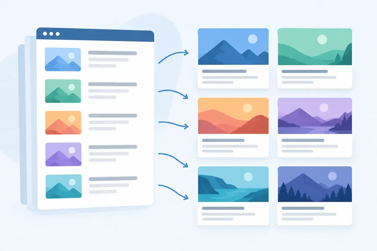
The scalable approach is not to make a new image file for every URL. It is to build one flexible card design, then connect its elements to the content already on your website.
Think of the design as a layout system. Your logo, type scale, color palette, spacing, and image treatment stay consistent. The page data changes automatically. A blog post pulls its headline and featured image. A documentation page pulls its title and section label. A product page can pull its product name, price, and primary visual.
This is the distinction between an image library and an image system. An image library requires ongoing production. A system keeps working as your site publishes new pages.
For most teams, the first design should cover the majority of high-value URLs. Start with the pages that are regularly shared: articles, landing pages, changelog entries, documentation, collections, and products. Once that foundation works, you can add distinct designs where context truly changes, such as podcast episodes, job listings, event pages, or customer stories.
Start with the card hierarchy, not the template
Preview cards are small. Platform layouts crop them, resize them, and place them beside other visual noise. That means hierarchy matters more than decoration.
Put the most useful information first: a readable title, a recognizable brand marker, and one strong visual cue. For an article, that might be the headline plus a featured photo. For a SaaS landing page, it could be the product name, a concise benefit, and a product screenshot. For documentation, a category label and page title often work better than a stock image.
Avoid trying to fit your whole page into the card. Tiny body copy, dense navigation-like layouts, and multiple calls to action usually become unreadable in a feed. A preview card should create recognition and curiosity, then earn the click.
Image choice is a trade-off. Featured images add emotional pull and make editorial content feel distinct. But they can compete with long titles or look inconsistent if contributors upload wildly different photography. A colored background, subtle pattern, or product UI crop may produce a more controlled result for technical content and SaaS pages.
Map the fields that change by page
Once the layout is clear, identify the data that should populate it. Most sites already have useful fields in their CMS, theme, or page source. Titles, excerpts, featured images, authors, categories, prices, publication dates, and canonical URLs are common examples.
The key is to decide what happens when a field is missing. Not every article has a featured image. Not every product has a short subtitle. If your design depends on a field that is sometimes empty, set a fallback before publishing at scale. You might show a branded background when no image exists, shorten a title after a sensible character limit, or hide an optional label rather than leaving an empty space.
This is where manual workflows quietly fail. A Canva file can look excellent for one post, but it cannot reliably account for new content, missing assets, title length, and changes in your CMS. Someone has to catch every exception.
With dynamic page-data mapping, the design rules handle those cases once. Every future page inherits them.
Keep Open Graph tags and rendering responsibilities separate
A preview card is only useful if social platforms can find it. That usually means your page needs Open Graph metadata, especially an `og:image` value pointing to a publicly accessible image. Depending on the platform, title, description, and card-specific tags may also affect the final result.
Many sites already manage page titles and descriptions through Yoast, Rank Math, an SEO plugin, a CMS, or custom metadata. You do not need to replace that setup just to improve visuals. Keep the tools that own your SEO fields, then use an image-rendering layer to provide a page-specific image URL.
For WordPress, Ghost, and Webflow users, that can mean adding a lightweight integration that reads existing page data. For Next.js, PHP, HTML, and custom sites, it may mean adding a tag or endpoint to your existing metadata logic. The implementation varies, but the goal stays simple: each URL exposes an image generated for that URL.
getwowlink is built for this model. You design the card once, connect the page data once, and every page gets its own OG image without turning image production into a recurring task.
Design for the platforms you cannot fully control
Social platforms do not render cards identically. LinkedIn may emphasize one crop. Slack may display the title differently. Messaging apps can be aggressive about caching. X can show a different card treatment depending on metadata and account context.
You cannot dictate every pixel of every platform preview. You can control the source image and metadata well enough that the card remains clear across the places your audience shares links.
Use a landscape image size that gives platforms room to crop without cutting off essential text. Keep logos and key copy away from the outer edges. Do not place critical details in the lower-right corner, where interface elements can sometimes interfere. Test a few real URLs across the channels your team actually uses rather than relying on one browser preview.
A multi-platform preview checker is useful here because it reveals problems before a launch post, newsletter, or partnership announcement goes out. Check a blog URL, a product URL, a long-title page, and a page without a featured image. Those four cases expose most design and data issues.
Plan for caching before you need a fix
The most frustrating preview-card bug is often not a bug in your design. You update an image, share the URL again, and the old card still appears. That is caching.
Platforms cache link metadata and images on their own schedules. Some refresh quickly. Others keep an older preview longer than you expect. If the URL is unchanged, re-sharing it does not always force a fresh scrape.
Build a simple launch habit: finalize page content, verify the image and metadata, then share. If you must change a card after it has circulated, use the platform's available re-scraping or debugging process where applicable. Avoid changing URLs only to work around a preview issue unless the campaign stakes justify it.
For ongoing publishing, stable automation reduces these problems. New content gets its correct image when it goes live, rather than receiving a rushed manual card after the first person notices the default preview.
Make ownership clear across content, design, and engineering
Preview cards sit between teams. Marketing cares about message and distribution. Design cares about brand consistency. Engineering cares about reliable metadata and page performance. Without a clear system, each new request becomes a small handoff chain.
The better operating model gives each team control over its part. Designers define the reusable visual rules. Marketers and content teams publish pages as usual. Developers install and maintain the connection without becoming the image-production queue.
That is especially valuable for agencies and multi-site teams. A repeatable card system lets you preserve each client's identity while applying the same quality checks across portfolios. It also gives you a clear answer when a client asks why a shared link looks wrong: inspect the page data, the image mapping, and the cached platform preview in that order.
Your next shared URL should not need a design request to look credible. Set the visual rules once, connect them to the content you already publish, and let each page arrive in the feed looking like it belongs there.
