
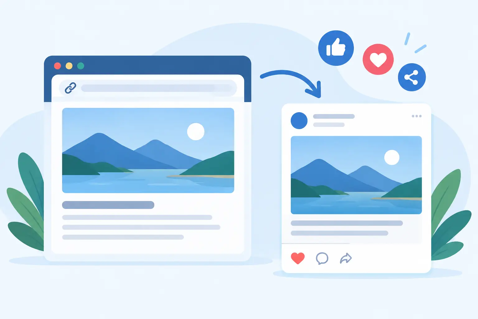
A founder posts a product update on X. A marketer drops a new article into Slack. A customer shares a pricing page in a group chat. Instead of a sharp visual card, the link shows a grey box, an old logo, or no image at all. That is what a neglected social preview image costs: attention before someone has even reached your site.
A strong preview is not decoration. It is the first version of your page many people see. When the card is clear, recognizable, and relevant to the URL, it gives the click a reason to happen. When it is broken or generic, the link looks unfinished - even if the page itself is excellent.
What Is a Social Preview Image?
A social preview image is the visual card image displayed when someone shares a URL on platforms such as LinkedIn, X, Facebook, Slack, WhatsApp, iMessage, and Discord. It usually appears beside a page title, description, and domain.
Technically, the image is commonly provided through Open Graph metadata in your page’s HTML. The key tag is usually `og:image`. Some platforms also read related tags for the title, description, image dimensions, and image type. X may use its own card tags, but Open Graph metadata remains the practical foundation for most shared-link previews.
The important distinction is this: your website hero image and your social preview image do not have to be the same thing. A hero image is designed for someone already on the page. A preview image is designed to earn attention in a crowded feed, inbox, or chat thread.
That difference changes the creative brief. The preview needs to communicate quickly at a small size. It needs enough brand presence to be recognizable without turning into a tiny billboard. And it needs page-specific context, so a shared blog post does not look identical to your homepage.
Why Generic Link Cards Lose Clicks
A plain preview can still technically work. The URL resolves, the title appears, and the page is shareable. But functional is not the same as persuasive.
People scan social feeds and message threads at speed. They use visual cues to decide what looks credible, timely, and worth opening. A card with an irrelevant stock image, an awkward crop, or a missing thumbnail creates doubt. A card with the exact article title, product name, date, price, or featured image answers the basic question immediately: what am I about to click?
This gets more expensive as your site grows. A five-page marketing site can survive a few manual images. A content site, documentation hub, marketplace, SaaS product, or agency portfolio cannot rely on a designer to produce a new card for every URL. That is where teams fall into one of two bad patterns: they use one generic image everywhere, or they publish new pages without checking previews at all.
Neither scales. Every new page is another chance for your brand to arrive as a grey box.
What a Good Social Preview Image Includes
The right composition depends on the page type and where your audience shares it. A launch announcement needs a different treatment than a help article. An ecommerce product page may need the product, price, and offer. A blog post may need the headline, author, and featured image.
Still, most effective cards make three things obvious: who the content is from, what the page is about, and why the page is distinct from the last URL someone shared.
Keep text large. A card that looks polished at full resolution can become unreadable in a Slack sidebar or mobile message. Use high contrast, leave room around the title, and avoid putting critical text near the edges, where platforms may crop it differently.
For most platforms, a 1200 by 630 pixel landscape image is a dependable starting point. It is not a guarantee that every app will show the same crop, because each platform has its own layout and cache behavior. But designing within that common ratio reduces surprises.
Avoid treating the image as a miniature landing page. Small logos, dense paragraphs, feature grids, and several calls to action rarely survive social-card size. One strong visual, a concise title, and consistent brand elements usually do more work.
The Hidden Problem: Every Page Needs Its Own Card
The difficult part is not designing one great image. It is maintaining quality across hundreds or thousands of current and future URLs.
Think about the data already on your site. Your CMS or application knows the page title, featured image, author, publication date, product price, category, and canonical URL. That data changes as your content changes. Yet social previews are often handled outside that system in a folder of Canva exports, an outdated WordPress setting, or custom code that no one wants to touch.
This disconnect creates predictable problems. A headline changes but the image still shows the old headline. A product launches without a card. A new documentation page inherits the homepage image. A featured image is too small, so Facebook chooses something random from the page.
The fix is to make preview generation part of publishing, not a separate design task. Design a reusable card once, connect it to the data your pages already expose, and render a fresh image for each URL. That can mean one sitewide design or different designs for your blog, changelog, docs, product pages, and case studies.
The goal is simple: you do not make images one by one anymore. Your website makes them from the content you publish.
How to Set Up Social Preview Images Without a Developer Queue
Start by auditing what visitors currently see. Paste representative URLs into a multi-platform preview checker: your homepage, a recent post, a product page, a category page, and a page with a long title. Check the image, title, description, source domain, and crop. Do not test only one network. Slack, LinkedIn, X, and WhatsApp can reveal different issues.
Next, decide which page data belongs on each card. For a blog, that might be title, category, author, and featured photo. For a SaaS site, it may be page title, product screenshot, and a small brand mark. For docs, clarity beats visual flourish: document title, product area, and a clean identifier are often enough.
Then create a design system rather than a pile of files. Establish type sizes, color treatments, logo placement, safe zones, and image rules. Keep the template flexible enough for a two-word title and a 90-character title. Long-title handling is one of the easiest things to miss until a high-value page ships with text spilling off the image.
A tool such as getwowlink can connect that design to your existing page data, render and host the image, and serve the right Open Graph image for each URL. That approach works whether your site runs on WordPress, Ghost, Webflow, Next.js, PHP, plain HTML, or a custom stack. It also lets marketing own the visual system without replacing SEO tools that already manage the rest of your metadata.
Rendering and Caching Are Part of the Job
A perfect image file is useless if a platform cannot fetch it. Social crawlers need a publicly accessible image URL, correct metadata, and enough time to retrieve the page. If your image requires login, is blocked by server rules, or renders too slowly, the preview may fail.
Caching adds another wrinkle. Social platforms often store preview information after the first time a URL is shared. Updating `og:image` does not always update an old post or message immediately. Some platforms offer a way to re-scrape a URL; others refresh on their own schedule. This is why preview testing should happen before a launch, not after a campaign is already live.
Use absolute image URLs. Make sure the image is large enough, uses a widely supported format, and remains available over HTTPS. If your preview service generates images dynamically, confirm that it can handle crawler traffic reliably and does not produce blank cards during a traffic spike.
Treat Shared URLs Like Published Assets
Your social preview image is not a tiny SEO checkbox. It is a distribution asset that travels wherever your URL travels: community posts, sales conversations, press mentions, launch threads, customer messages, and internal updates.
The best setup is rarely the one with the most design effects. It is the one that keeps every page accurate, on-brand, and ready to share without asking someone to open a design file. Build that system once, then let every new URL show up looking like it belongs to you.
